An Interview with Sydney Smith
Sydney Smith
September 3, 2019
We interviewed Sydney Smith, award-winning illustrator of children’s books and now author of his first picture book Small in the City. He has illustrated titles including The White Cat and the Monk, by Jo Ellen Bogart, Sidewalk Flowers, by JonArno Lawson, on The New York Times Best Illustrated Children’s Books in 2015 and Town Is by the Sea, by Joanne Schwartz, winner of the 2018 Kate Greenaway Award and listed as one of The New York Times Best Illustrated Children’s Books in 2017. Originally from Nova Scotia, Smith lives and works in Halifax, Canada.
A Selection of Work
September 3, 2019
Our interview begins with Sydney’s response about his role as an illustrator and a storyteller.
At a certain point, in the journey of an illustrator, you come to an understanding that you are only as good as the collaboration between the text and image. If the story doesn’t read well you have failed and if all your efforts were to highlight your skill as an artist the project suffers.
Your childhood has impacted your work as an illustrator. In what ways?
I am sure that it’s not true for everyone but my relationship with art making came from challenging moments in childhood. I was never exceptionally talented in drawing, and I didn’t enjoy drawing more than anyone else when I was very young. I moved a lot after my parents separated and in those places I met friends and bonded through drawing. Mostly superheroes and monsters (secretly I still love drawing monsters). When I moved away from those friends I continued drawing as an escape or sanctuary. This happened at the age that many kids stop drawing, around 12 years old, when they are told that if you can’t “draw” you shouldn’t do it. And it’s an age when most kids feel awkward and alone.
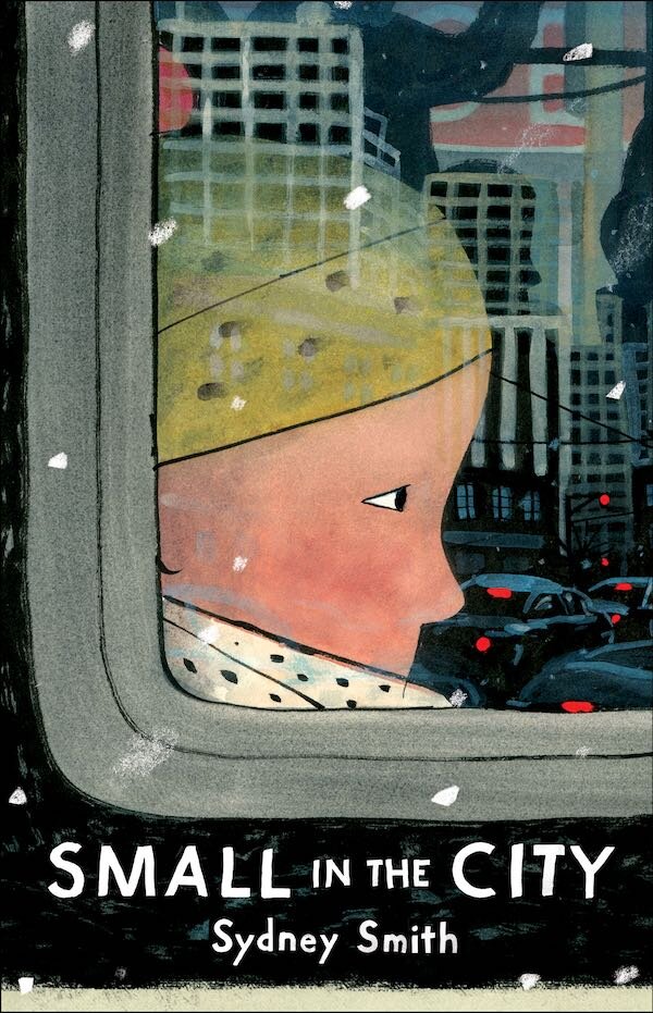
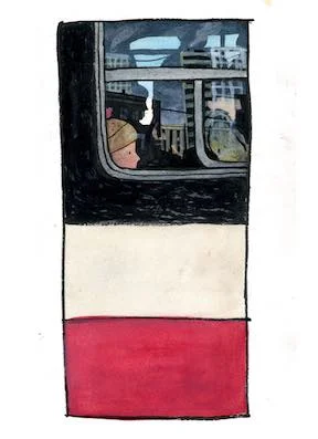
Cover of Small in the City, Sydney Smith
You have suggested that it can be limiting creatively to focus on the sense that you are creating a book “for children”.
I have found that I get in trouble when I make art for anyone but myself. That includes the audience. Even the term “children’s book” can be limiting. We all have limited ideas surrounding what it is to be a child and it’s hard to dive deep when you are jumping from such a low height. Instead, we should be asking what is to be human, including children. And then just write for yourself. That was a gradual mental shift I had while working with Sheila Barry, the editor at Groundwood Books. She didn’t impose on the creative process, instead she nurtured a self-confidence that I hadn’t known before.
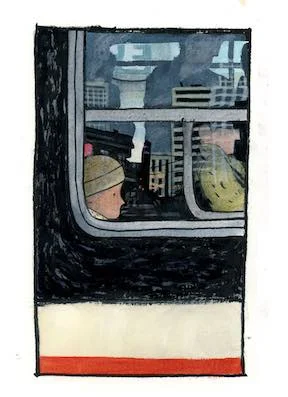
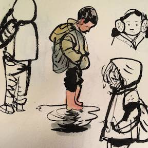
Preliminary versions and sketches for cover of Small in the City, Sydney Smith
Small in the City is the first book that you wrote and illustrated. What did that experience tell you about how you approach your work? Does the idea for a possible story come first or do sketchbook drawings inspire a direction?
Small in the City is my first written book. I have always wanted to write and, through the experiences of collaborating with authors, I have learned what type of stories I respond to and where my strengths lie, as well as, where they do not. Not having written before, I had no sense of my own voice or style of writing, instead I came at it more systematically. I knew that the benefit of being both illustrator and writer is that the text and image can weave and dance more intricately so I tried to write a story that couldn’t fully be told in the images or the text.
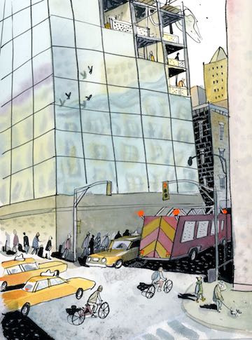
Interior pages from Small in the City, Sydney Smith.
One of the drawbacks of illustrating for a separate writer is that sometimes the manuscript I am offered is too complete by the time it reaches me. Often, there isn’t enough room for the illustrations to fully develop as a coauthor. Given the room, they can add layers to the story, change it, and make a more dynamic narrative with multiple levels of interpretation. That engages and challenges the reader and ultimately results in a more rewarding experience. This is what works for me and how I like my stories told.
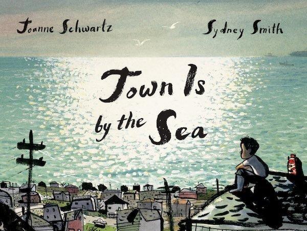
Cover of Town Is by the Sea, by Joanne Schwartz, illustration by Sydney Smith
I learned in Town is by the Sea that illustrations can create an unreliable narrator. By showing a separate truth than the text, there is a dissonance that occurs and as an illustrator, I have a special advantage. When there is a discrepancy between images and text the reader looks to the images for the true reality and a new, more complicated comprehension occurs. From there on, there is an alliance between illustrator and reader. The text or the voice of the character is then interpreted and informed by the truth of what you see. I knew that I wanted to tell a story that was told through a voice of an unreliable narrator. There are parts of Small in the City that show that the character is hiding their true feelings.
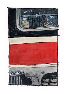
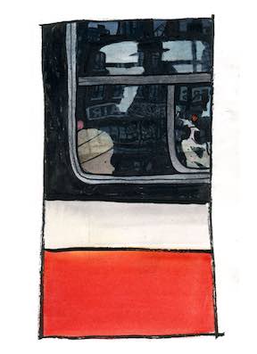
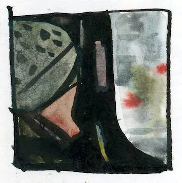
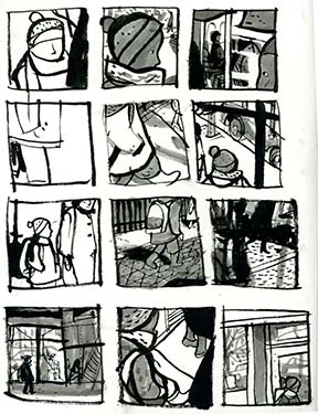
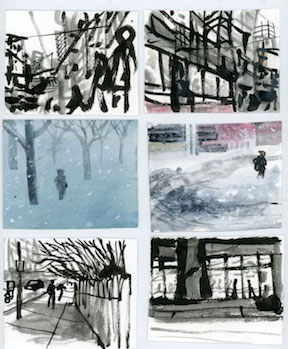
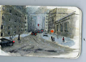
Preliminary sketches by Sydney Smith for Small in the City,
Small in the City started as sketches. I filled sketchbooks, and taped photos to the wall. In fact I did as much preparation as I could, but really, I was stalling because I was terrified of writing. I was afraid that I couldn’t write.
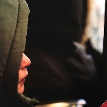
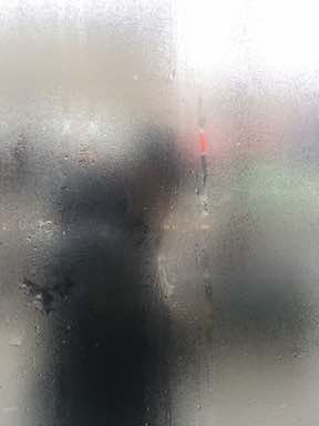
Photo research shots and sketches by Sydney Smith for Small in the City
Writing my own book has taught me that there is a special chemistry that happens when I collaborate with other authors. I love the challenge of problem solving and the thrill of risk taking when working with another author’s text. When I write for myself there can be a bit of a feedback loop and I’m never satisfied. There is an extra level of responsibility when working on an author’s text. I want to do as much as I can to honour their work. I think that can bring out my best work I can give.
Do you plan to write more books and also continue to illustrate for other authors’ work?
My plan is to continue writing and collaborating for as long as the stories keep coming.
Interior spread from Town Is by the Sea, by Joanne Schwartz, illustration by Sydney Smith
Interior spread from Town Is by the Sea, by Joanne Schwartz, illustration by Sydney Smith
Interior spread from Town Is by the Sea, by Joanne Schwartz, illustration by Sydney Smith
We admire the subtle pacing within your books and the impact of layout, even within your illustrations (the miners in a sliver at the bottom of the page in Town Is by the Sea, for example). Adding the spread (and dismissing page count!) while the boy waits for his father to return added such drama. Is that an instinct for storytelling that drives you to make those decisions?
I think there are a few instincts in play. I enjoy anticipating how the reader follows the story. It’s a bit of a tightrope walk when trying to manipulate the audience. Be too obvious and they will push back, be too subtle and you risk confusion. I want to make the book challenging but I also don’t want it to be osbcure. There needs to be a payoff for the challenges you present the reader.
Adding the silent spread was intuitive. Some stories I have worked on were possible to punctuate with silence. Pacing is important to the flow of the story and engaging the reader but it also involves knowing when the story needs the sustained ring of the words. Illustrations can control how the story is read and can add weight to words or flip them upside down. There’s a lot of power there.
When I was a kid my dad went to a psychic. He asked them about his children and they said that I should be a movie director and that I would be as famous as Spielberg. I never forgot about that. I get a lot of inspiration from the innovation film and languages of film and picture book illustrations are very similar.
Growing up in Nova Scotia, what aspects of your early years there influenced your creative work? And in what ways?
It’s hard to identify what Nova Scotia brought to my creative work. I grew up around books, libraries were sanctuaries, and my sister is a poet. My older brother displayed a deep passion for his interests in maps and nature, my mother is an extremely empathetic person and my father’s love of photography always informed my love of images and also helped solidify my memories of childhood.
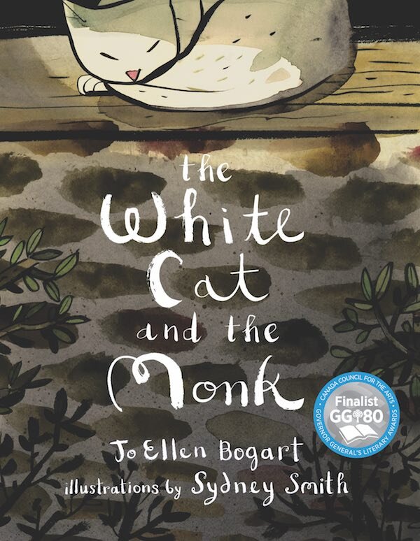
Cover of The White Cat and the Monk, by Jo Ellen Bogart, illustration by Sydney Smith
After returning to my home of Nova Scotia, I have the privilege of seeing it with perspective. Much of the six years I was away I was working on material that transported me back. More and more, I have been creatively drawn to the beauty of water, reflections and light. These were some of the elements of my childhood in Nova Scotia and continue to be at the core of abstraction or distortion of life and memories.
The country is quiet and there were moments of mindfulness and the sublime found in unremarkable places. I suppose I am always trying to recapture those feelings.
You have referred to a “rural mentality” that rejects the limelight or attention focused on an individual. How did that atmosphere affect you? Does it still inform your work as an illustrator and now as an author?
It may occur around the world but I have found there is a certain allergy to pride in the communities I grew up in. “Don’t get too big feelin’ ” translates to “Pride comes before a fall”. For the people of many rural communities, fortune is fleeting and not to be trusted. My grandmother often said “I didn’t ask for much and that’s just what I got”. It can be difficult at times to admit having goals and dreams. What’s even worse is when they come true.
I think I pay a lot of attention to tone in the stories I illustrate and it is related to my fear of pride. It can be unseemly to bathe openly in sentimentality and I believe readers prefer the implications of vulnerability and raw emotions. I know I do. There’s a sweet spot, balancing on the edge of sentimentality, and I try to balance there but sometimes I fall right in.
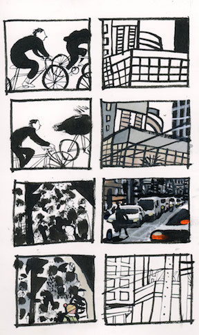
Your illustrations are often framed like a graphic novel or comic. What (beyond your love of Calvin & Hobbes and comics in general) leads you to this approach? And when do you abandon that format for full-page treatment?
Panels can help any lots of ways. They can be useful as a way to pick up the pace as in showing a character travelling or to describe the details of a scene.
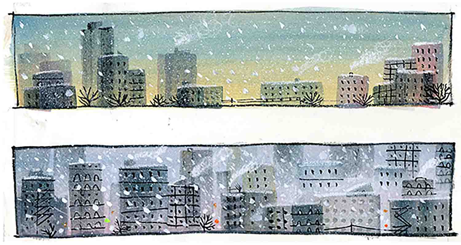
Smith’s preliminary sketches from Small in the City
You are still considering the page as a canvas. Even though there are images that are split up around the page, they still have to work visually as a whole. I like how much information can be condensed onto a page and the format itself can communicate the mood.
Interior spread from The White Cat and the Monk, by Jo Ellen Bogart, illustration by Sydney Smith
Interior spread from The White Cat and the Monk, by Jo Ellen Bogart, illustration by Sydney Smith
Interior spread from The White Cat and the Monk, by Jo Ellen Bogart, illustration by Sydney Smith
Choosing the right format for the page, all depends on the text. What moments are descriptive of actions, what describes an emotion and when is it time to stop. Is there a moment that needs punctuation? Where a character stops or a character has moment of clarity? Or perhaps when something sweet and/or quiet occurs. The illustrations control the speed of the reader and forcing a pause in the readers voice with a full page or double page or even a wordless spread, can highlight a moment and the words echo. By using a variety of formats on the page, the illustrator has a wider range of control over how the text is read.
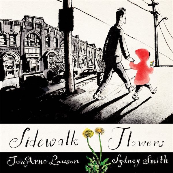
Cover of Sidewalk Flowers, by JonArno Lawson, illustration by Sydney Smith
Though your technique does vary from book to book, brushwork figures prominently. Can you elaborate on why that is often your medium of choice? Primarily with a Pentel Brush Pen?
I’ve always used ink, probably because of my early interests in comics, Rackham and Gorey. But for me, ink and brush is therapeutic. I am naturally a nervous person with an unreliable confidence but the brush encourages me to be the person and artist I would like to be. The brush works best when you are relaxed and confident, the character of the line is so beautiful when you trust in it and play. Play is something I forgot in drawing. Professionally illustrating can take up a lot of time and I am trying to encourage myself to enjoy experimenting and improvising again. The book I am finishing right now has no brush and ink. Instead I have experimented with other materials and I’m having a blast. I think that it comes through in the final results and that’s the best you can ask for. Whether the risks I took succeeded or not, at least I had fun.
Interior spread from Sidewalk Flowers, by JonArno Lawson, illustration by Sydney Smith
Interior spread from Sidewalk Flowers, by JonArno Lawson, illustration by Sydney Smith
Interior spread from Sidewalk Flowers, by JonArno Lawson, illustration by Sydney Smith
What is the most significant change you have seen within your work as your career has progressed? Did it surprise you?
I had a moment, when I first moved to Toronto, when I decided that I would pretend to be the artist I wanted to be. I was starting work with a new publisher, Groundwood Books, and I saw the opportunity to reinvent myself. Before that, I had been stuck working in a way that grew to be unsatisfying but I thought that I had to be consistent. But it turns out nobody cares. So I pretended to be confident, I pretended to be the artist who trusted their own intuition. After a while I forgot I was pretending. That’s not to say I changed. I just gave myself the permission to be myself. That’s always hard. Every day I have moments when I question my own validity.
You are a fan of Edward Gorey books. What about his work impresses you or speaks to you as an artist?
Edward Gorey was a master of ambiguity in the way he combined his text and the way he framed his images. Implying a gruesome death or a hideous crime is so much more impactful than just showing it. The darkness of his stories was also quite thrilling. Obviously, he wrote for himself. It must have created problems for his publishers when his mysteries were too gruesome to be marketed to children, but he answered to his own mind and the results were innovative and singular.
A challenge can also drive you as an artist. What do you foresee as the next approach that may provide a creative risk for you?
Challenging myself is the primary goal of working. I cannot be excited about a project unless I challenge myself to take risks and work outside my comfort zones. I tend to start a project open and free and build up rules as I go. Most of my challenges are about breaking those fake rules. Or setting my goals and expectations so high that although I may never reach them I still achieve far more than I could before. The fake rules I impose are usually about materials I use or the way I pace the story or external expectations. For the next book, I play around with materials I haven’t tried before and a style that is different than I am used to.
Thank you, Sydney, for sharing your work and your process!
For more on Sydney Smith:
All images are used with permission from Sydney Smith, Groundwood Books and Holiday House.
Sidewalk Flowers © 2015 by JonArno Lawson, illustrations © 2015 by Sydney Smith.
Reproduced with permission of Groundwood Books Limited.
The White Cat and the Monk © 2016 written by Jo Ellen Bogart, illustrations © 2016 by Sydney Smith. Reproduced with permission of Groundwood Books Limited.
Town Is by the Sea © 2017 written by Joanne Schwartz, illustrations © 2017 by Sydney Smith. Reproduced with permission of Groundwood Books Limited.

