An Interview with Kris Di Giacomo
Kris Di Giacomo
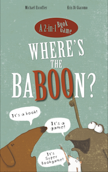
We interviewed Kris Di Giacomo, noted illustrator of children's picture books. Take Away the A, by Michaël Escoffier, was named one of Publisher’s Weekly’s Best Children's Books of 2014 and given a starred review by Kirkus Reviews. enormous Smallness, a biography of poet e.e. cummings by Matthew Burgess, also received a starred review. Born in Brazil to American parents, Kris now lives in Paris. She shared her views on her work and gave us insight into her illustration process. Her latest collaboration with Michaël Escoffier, Where's the Baboon? will be coming out in October.
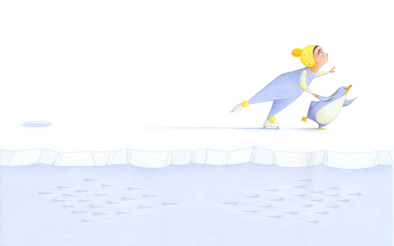
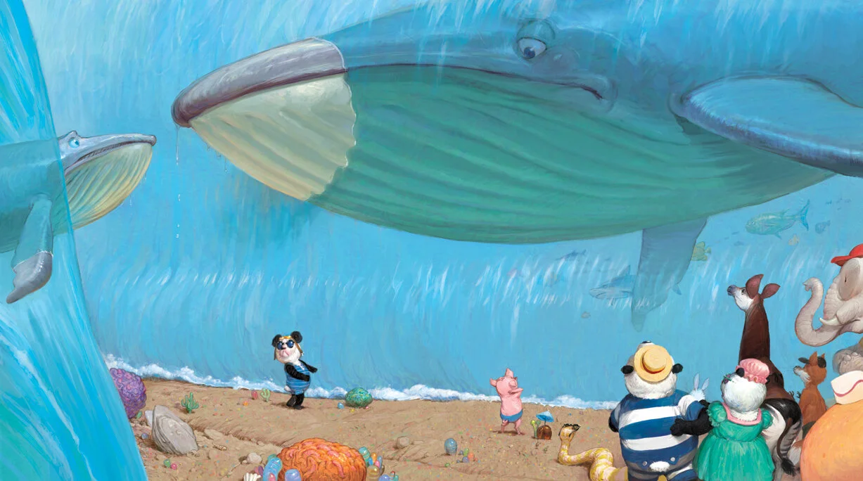
A Selection of Work
May 1, 2015
How would you say that your twenty plus years living in Paris has influenced your illustration style?
Paris has that worn, gray patina. I just love subtle nuances of washed out and aged colors. I think this shows up in my pictures. People have called my palette "muted" or "vintage" and I bet I got that from wandering through the streets of this city.
Also, I went to art school here and have had so much access to art in this city.
What about your early childhood in Switzerland?
My memories of childhood are filled with story books and fairy tales, mountain walks, snowmen, ski slopes, magical gardens and enchanted forests, swimming pools and swimming lakes, birthday parties and giggles, best friends and stuffed animals and farm animals, Heidi . . . and time alone to think and draw.
You taught English to children in France and that led you to begin to illustrate books for them. How would you say the books in French differ from those you see written in English and published in the U.S.? Style, subject matter, depiction of childhood?
I grew up with books in English. I think a lot of books cross borders and are translated so that we don't necessarily know where they originated and we appropriate them in our own languages. I can't really say that I can differentiate the styles or subjects here in France as opposed to the ones in the U.S.
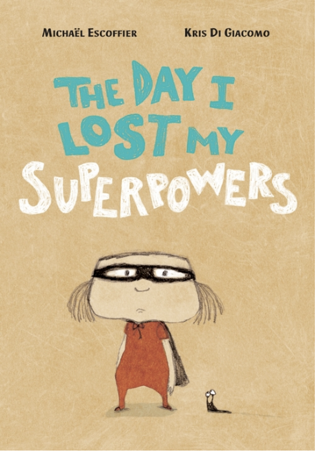
Cover of The Day I Lost My Superpowers, Michaël Escoffier, illustration by Kris Di Giacomo
We've read that you prefer to choose manuscripts with an aspect that you can enhance with visual humor. Are there specific examples from your books that you can describe?
In The Day I Lost My Superpowers (Michaël Escoffier, Enchanted Lion Books, originally from Kaléidoscope) Michaël wrote a text that says one thing and my job was to illustrate a different reality. The humor (and the understanding) of the story only really works if you can see the pictures. For example, the picture tells you that the child, who says she has the power to make things disappear, has actually just gobbled up the cupcake, leaving chocolate traces on her mouth.
Interior spread from The Day I Lost My Superpowers, Michaël Escoffier, illustration by Kris Di Giacomo
Interior spread from The Day I Lost My Superpowers, Michaël Escoffier, illustration by Kris Di Giacomo
I like being able to create my own subtext in the pictures to add what the text can't tell. Sometimes we even take text out where the picture has made the words redundant.
Cover of Take Away the A, by Michaël Escoffier, illustration by Kris Di Giacomo
Your long time collaboration with author Michaël Escoffier is an unusual one for the industry as you keep in contact with him throughout your creation of the book. Does he give specific feedback on your preliminary illustrations or is it more general? How does that feedback impact your work?
We've been making books together since 2006 so along the way we've developed a comfortable dialog. I turn to him often for feedback because I want our vision to be in sync and because our exchange enables new possibilities. And it's more fun to have someone to talk to about things than going it alone.
Interior page from Take Away the A, by Michaël Escoffier, illustration by Kris Di Giacomo
Interior page from Take Away the A, by Michaël Escoffier, illustration by Kris Di Giacomo
Interior page from Take Away the A, by Michaël Escoffier, illustration by Kris Di Giacomo
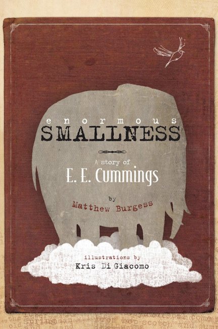
With enormous Smallness, which is a non-fiction biographical story of the life of American poet E.E. Cummings, I looked for a humorous thread that I could include discretely. It's not a funny book. But I tried to add some fun details throughout to entertain the reader and add another layer to the story.
Cover of enormous Smallness, by Matthew Burgess, illustration by Kris Di Giacomo
Interior spread from enormous Smallness, by Matthew Burgess, illustration by Kris Di Giacomo
Interior spread from enormous Smallness, by Matthew Burgess, illustration by Kris Di Giacomo
With enormous Smallness, you worked with a new writer, poet Matthew Burgess. Did you collaborate on visual interpretations of his text or was your illustration process separate this time?
enormous Smallness was really a 3-part collaboration between myself, Matthew and our tireless editor Claudia Bedrick at Enchanted Lion Books. There was a lot of cheer-leading going on during the months we worked and reworked the book which was inspirational and brought a lot of warmth to the project. Matthew and Claudia had already been working together for a while I came into the picture. I relied on Matthew who had done such a lot of research already but I also did a lot of my own research. I was cautious about respecting the integrity of his work since we were first-time collaborators but eventually an illustrator has to get in there and make a bit of a mess of things.
Interior spread from enormous Smallness, by Matthew Burgess, illustration by Kris Di Giacomo
Your animals have a unique quality. How do you develop those human characteristics?
I guess animals are just stand-ins for people in my drawings. I like to be able to have a conversation with a character while I'm drawing it, imagine it's voice and direct it like an actor in a movie. Growing up with stuffed animals, who I considered members of my immediate family, and with a deep love for Jim Henson's Muppets I find it instinctual to look for the animal in the human and vice versa. Maybe by personifying animals we put a sharper focus on our own traits and can provide the distance needed for more critical view of ourselves.
Interior page from Take Away the A, by Michaël Escoffier, illustration by Kris Di Giacomo
Pencil and paper are your traditional starting points for your work. Do you keep a sketchbook to jot your observations or do a quick color sketch?
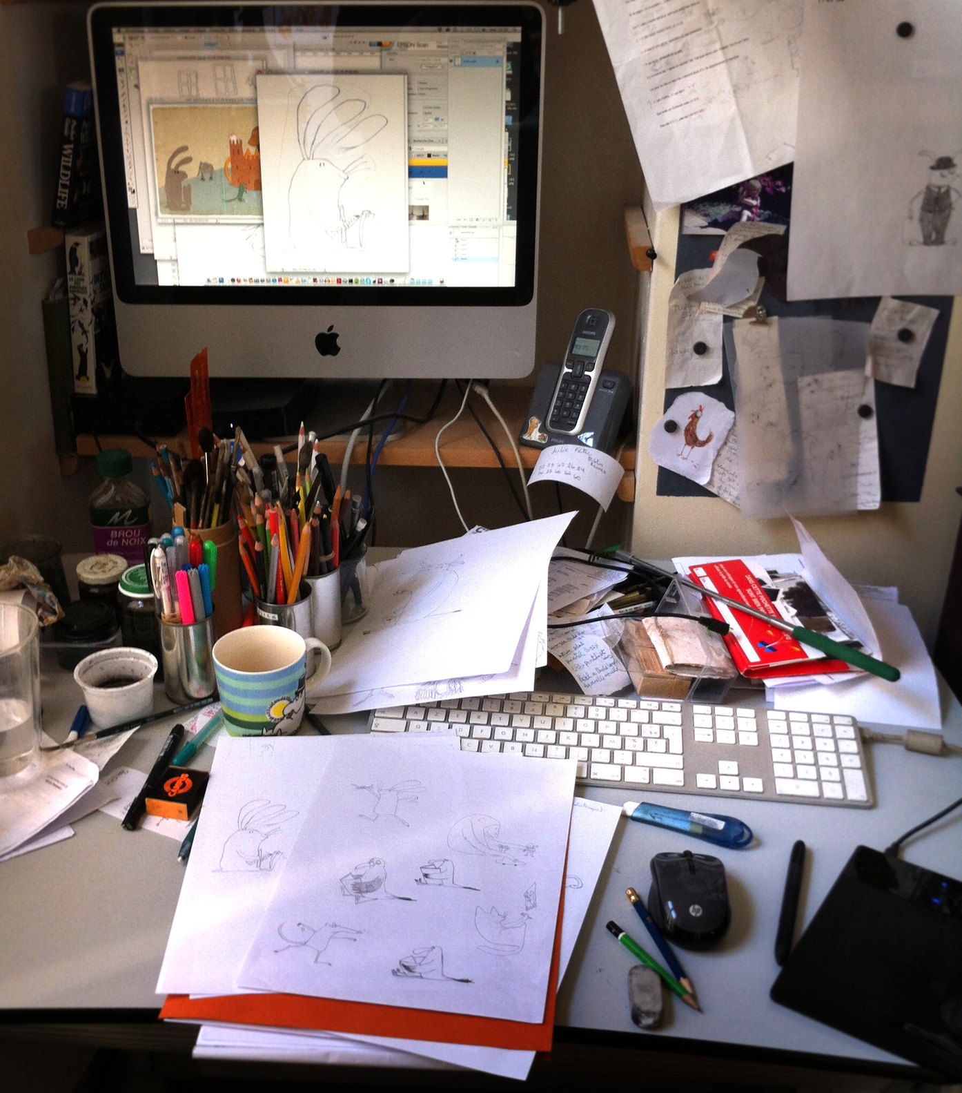
Art school taught me to always carry a sketchbook around with me, although nowadays it's more of a visual diary than a sketchbook and, while I do carry it around a lot, I don't draw in it that often! Most of the drawing I do for books is done with a pencil on white A4 paper at home in my studio where I can easily look up things I don't know how to draw.
Sketches from Di Giacomo’s sketchbook
I have a lot of pencils, brushes, papers and whatnot in my studio but what I use most often now for my illustrations is just a regular pencil on paper.
The computer allows you to combine your original sketches with computer generated color and scanned items. Can you describe that process and its impact on your final art?
In my computer I have years of collected and scanned elements that I bring together with the new drawings I've scanned in. Then I'm free to adjust colors, levels of light, composition, size etc etc. . . using the computer. The possibilities are endless.
Di Giacomo’s studio area
The downside of working this way is that I don't have "originals" that can be sold or hung in an exhibition for example. My final pictures get composed bit by bit drawing a chicken here, a chair there and then adding the multiple layers of color, texture, light, sugar, baking powder, and cooking at 350° for the right amount of time . . . It's a building-up process and an experiment which I play with until I feel it's ready to send off.
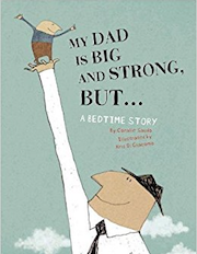
My Dad Is Big and Strong but . . . , by Coralie Saudo, illustration by Kris Di Giacomo
Interior spread from My Dad Is Big and Strong but. . . , by Coralie Saudo, illustration by Kris Di Giacomo
Interior spread from My Dad Is Big and Strong but. . . , by Coralie Saudo, illustration by Kris Di Giacomo
What is a favorite childhood picture book and do you still own your copy of it?
I don't have my childhood copies anymore but I have started collecting anew so I can look up from my desk and see Roald Dahl's (and Quentin Blake's) masterpieces on the shelf above, Winnie the Pooh, Pippi Longstocking, Snoopy . . .
I also have a wonderful set of Tove Jansson's books sent to me over the years by a dear friend who lived in Scandinavia. I had never heard of the Moomins until I had already started working in picture books. What a lovely discovery!
It's nice to be able to go back to the classics with older eyes but also to be able to discover new children's books as an adult that I didn't know as a kid. It keeps my inner child awake!
Thanks so much, Kris, for sharing your creative process.
A selection of Di Giacomo’s work
For more on Kris Di Giacomo:
All images used with permission from Kris Di Giacomo and Enchanted Lion Books.
